Making property investment feel possible — and urgent
Cribstock lets everyday Nigerians co-own properties and earn rental income from their phones. I joined to revamp what existed and introduce features that didn't. The result? A sell-out.
View live productThe context
Cribstock was already live. But something wasn't clicking.
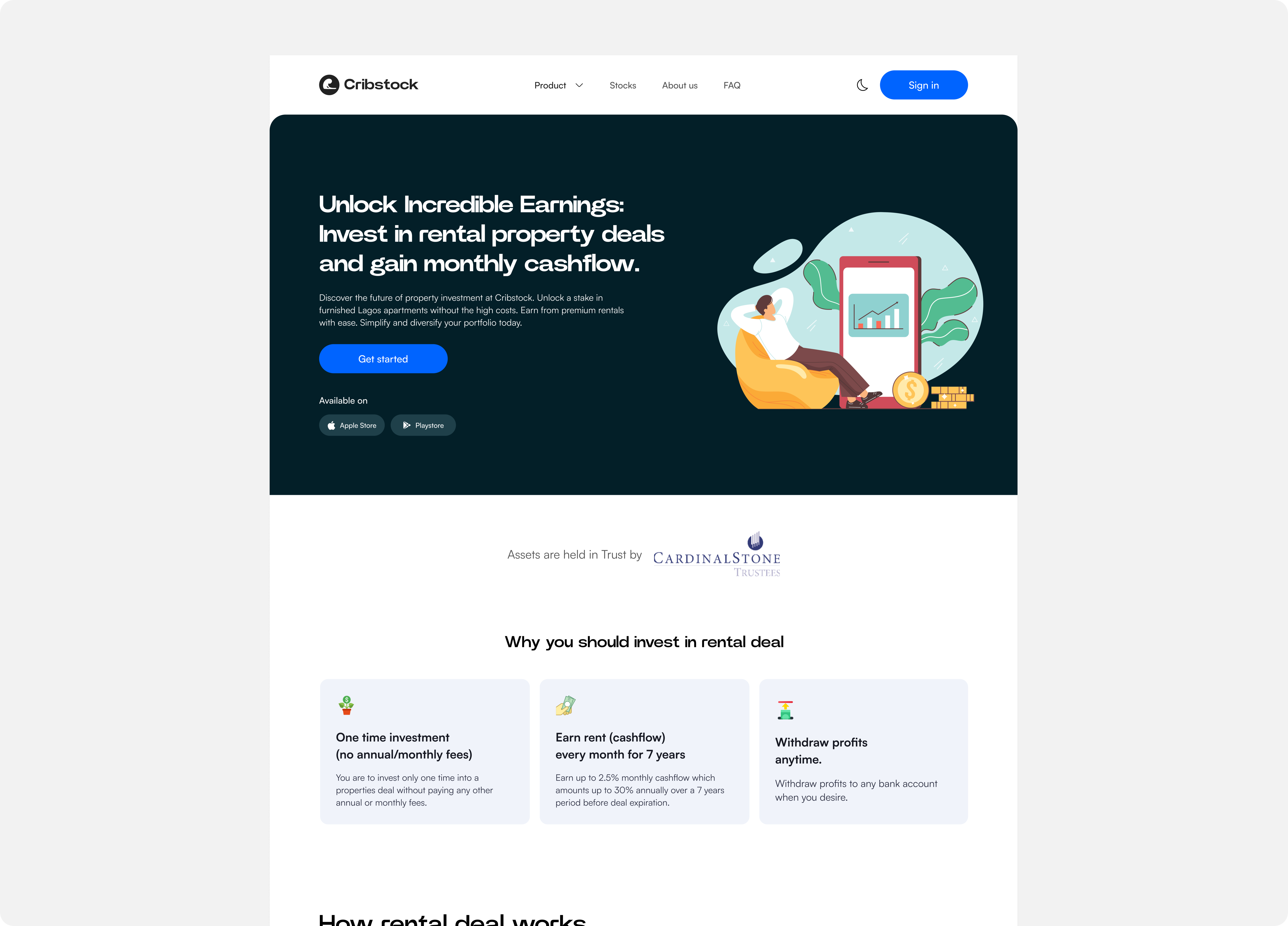
In Nigeria, property ownership has always felt like something that happens to other people. The prices are high, the process is opaque, and for most working people the entry point simply doesn't exist. Cribstock was built to change that. You could own a fraction of a real property, earn rental income paid directly to your wallet, and start from as little as ₦20,000.
The product was working. But when I joined, users were dropping off mid-purchase, the investor dashboard told you very little about what was happening with your money, and there was zero way to know what deals were coming or to follow a presale as it played out. I was brought in to fix all of that.
The problem
Imagine being a first-time property investor.
You've never owned real estate before. You're being asked to put your money into a building you've never set foot in, trusting that the returns will come. The app doesn't show you how close the deal is to selling out. You can't see what's coming next month. And the investor dashboard, which is supposed to be the thing that makes you feel in control, doesn't really show you much at all.
"You sign up. You browse a property. You start the purchase flow. Something confuses you halfway through and you leave. You never come back."
That was the loop Cribstock was stuck in. Drop-offs in the purchase flow. Low urgency around presales. A dashboard that wasn't earning trust. I had to fix the existing experience and then design the features that were missing entirely.
What I worked on
Four areas. Two revamps, three new features.
01 — The investor dashboard
The existing investor dashboard was there but it wasn't doing its job. Investors couldn't quickly understand their portfolio value, what income they had received, or what their wallet was doing. I redesigned it around what investors actually need to feel in control: value at a glance, income received, wallet activity. Clear hierarchy. No clutter.
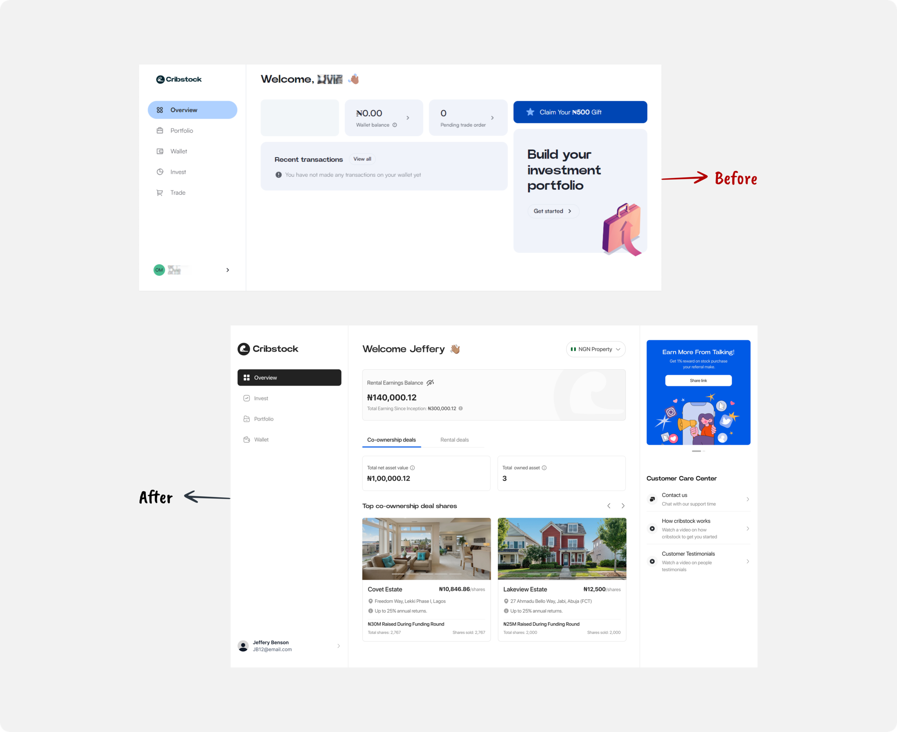
Dashboard — before & after
Desktop view showing the redesign in context
02 — The property purchase flow
Buying a property share had too many steps, too much jargon, and not enough reassurance along the way. I stripped it back. I made the pricing concrete, the returns tangible, and the steps feel like something a person designed rather than a compliance checklist.
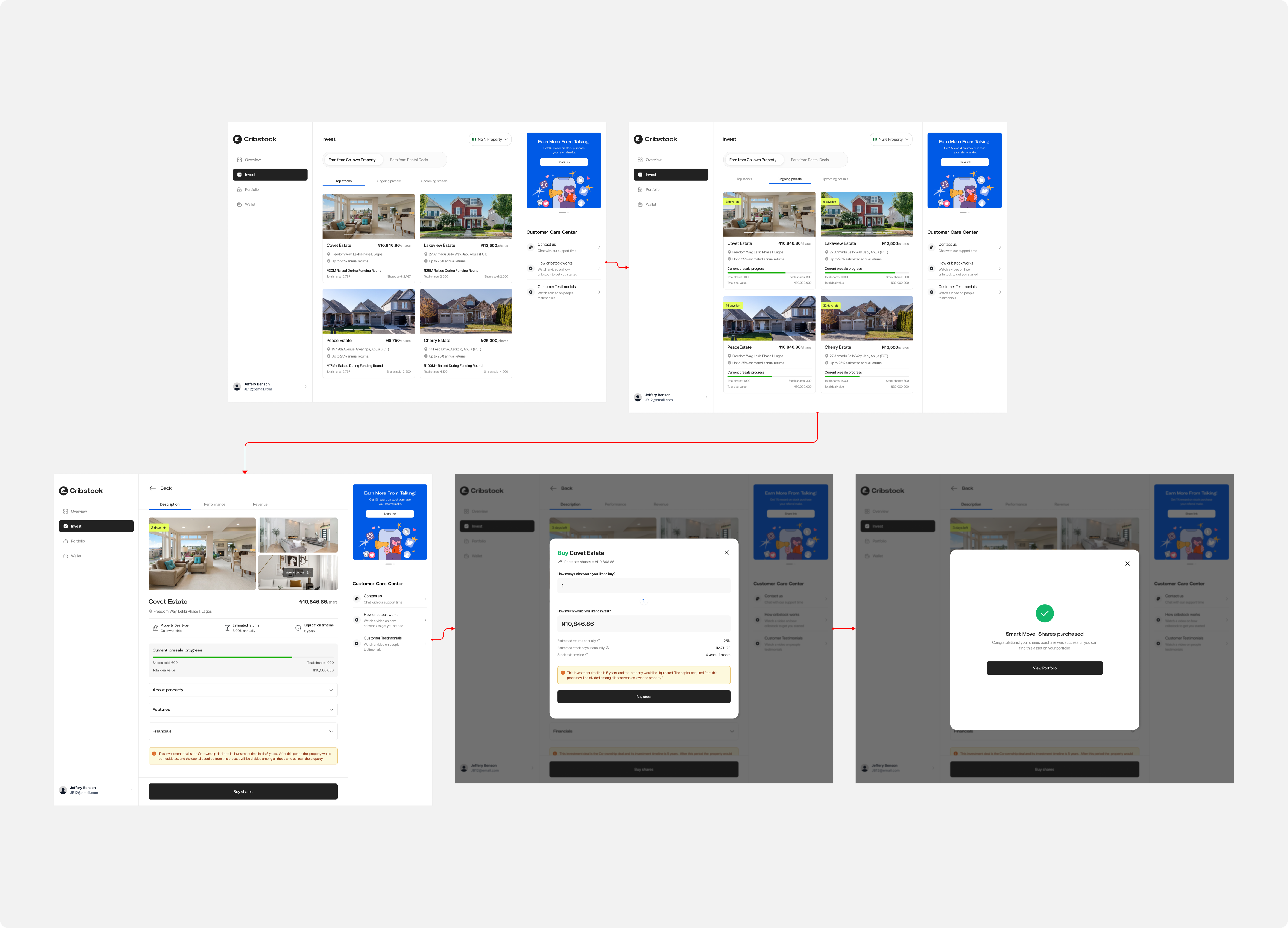
Property Purchase Flow
Key screens from the redesigned purchase journey
Drop-offs fell by 30% after the redesign shipped.
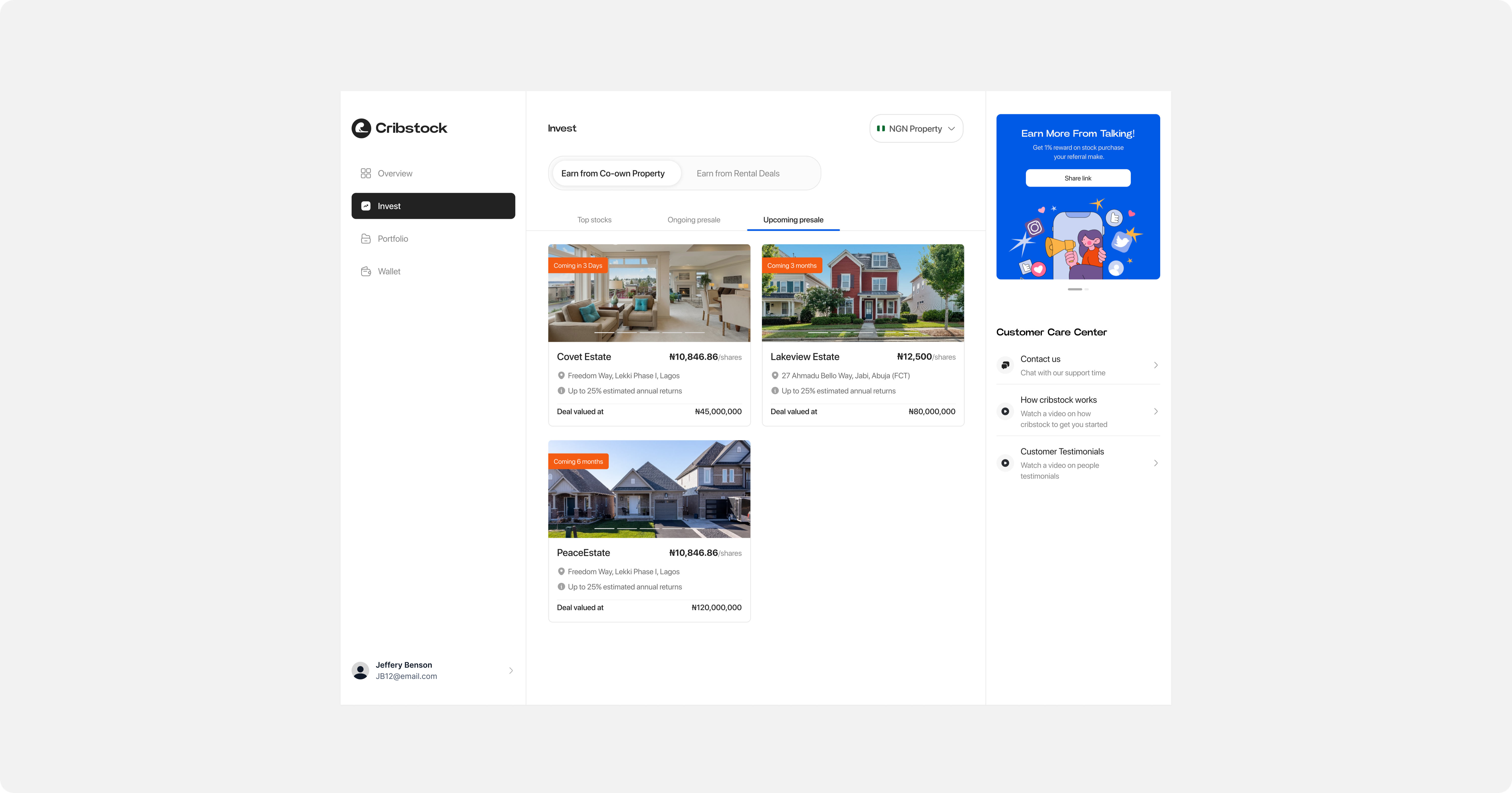
03 — The presale trackerNew
This one didn't exist before I joined. There was no way for an investor to see a presale unfolding in real time, how many shares had sold, how many were left, how close a property was to fully funded. I introduced a live progress tracker for each listing. Shares sold. Shares remaining. A counter that moves.
What I didn't fully anticipate was the psychological effect. When you can see a number going down, you don't want to wait. Investors started feeling urgency they hadn't felt before. Not manufactured urgency, just the honest reality of limited supply made visible.
"For the first time, we were able to sell out our new property stock quicker and faster. The revamp brought a kind of urgency to investors — they needed to hurry so they didn't miss out."
Presale Tracker
Live counter, progress bar, and remaining shares
Properties started selling out 80% faster. That's not a conversion tweak. That's a behaviour change.
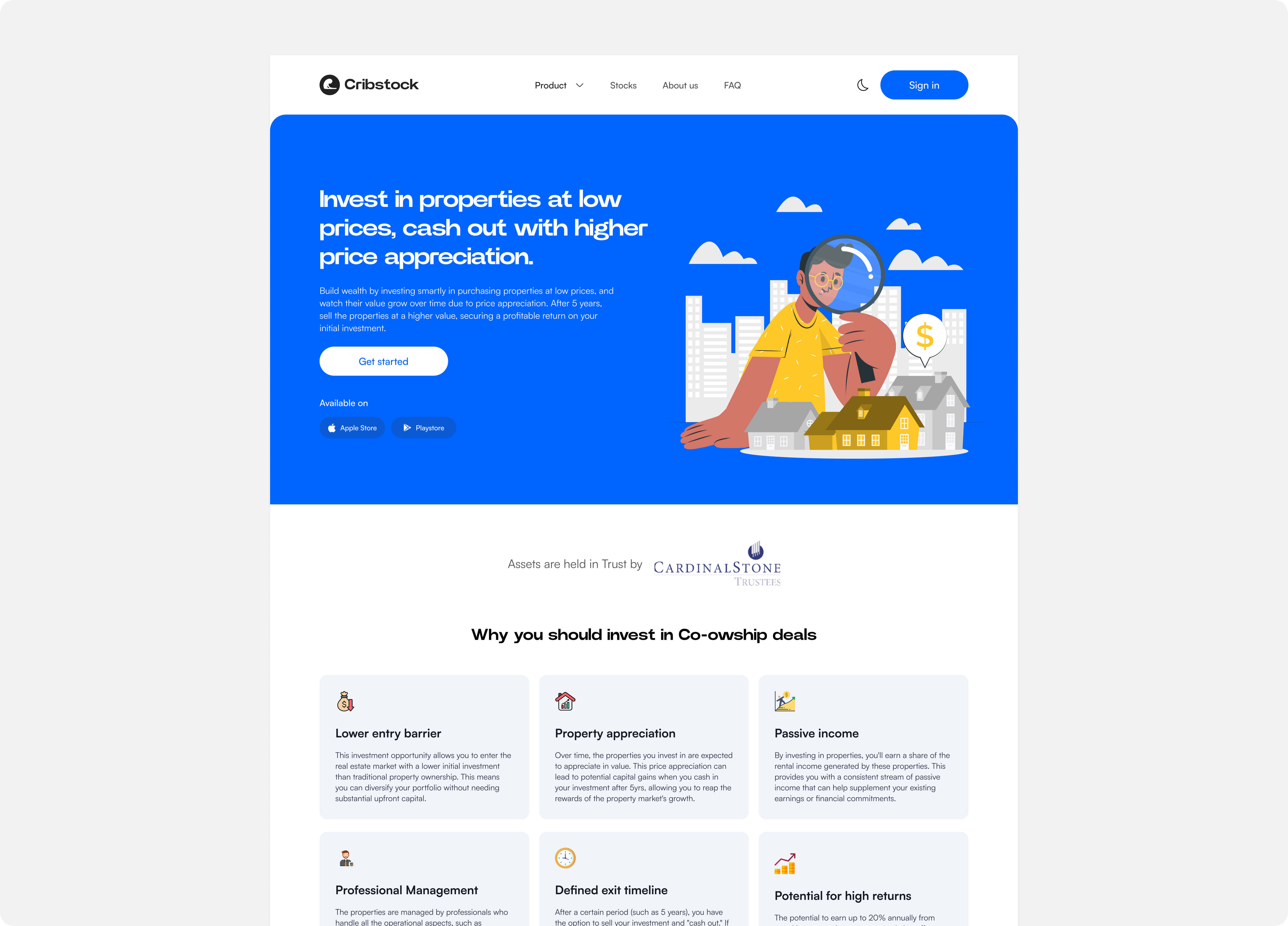
04 — Upcoming presales pageNew
If investors didn't know what was coming, they had no reason to stay ready. I designed a dedicated upcoming deals page showing future presales before they open, with the property details, deal valuation, and launch date visible. The goal was simple: let investors make up their mind before the clock starts. So when a presale drops, they're not deciding. They're acting.
Upcoming Presales
Deal cards, valuations, and launch dates at a glance
This contributed to the 50% increase in conversions. The decision was already made before the deal went live.
05 — Co-ownership & rental pagesNew
Cribstock offers two products: co-ownership (long-term appreciation) and rental (monthly cashflow). Neither had a page that actually explained what the deal was. I designed new website pages for both. The co-ownership page covers shareholding structure, property valuation, and exit timeline. The rental page covers income rate, payout schedule, and occupancy status. The kind of information that turns "maybe" into "yes."
Co-ownership Page
Shareholding, valuation, exit timeline
Rental Detail Page
Income rate, payout cadence, occupancy
The process
I tested with real investors, not imagined ones.
Every decision I made was informed by watching people who had never bought a property share try to do it. Not tech-savvy early adopters but working professionals who needed to feel confident handing over real money for something they had never done before. Their hesitation and confusion told me exactly what to fix. Their relief when something worked told me I was on the right track.
"I never thought I would be able to own a property especially in Lagos because of the high costs — Cribstock gave me that opportunity."
— Cribstock user, via TechCabal
I worked with 2 PMs and 6 engineers across all of this. 50+ design specs shipped at 98% accuracy, which meant engineers almost never needed to come back with clarifying questions. I treated every spec as documentation, not just a handoff. That discipline cut revision cycles in half and kept us moving fast.
The impact
The numbers that came out the other side.
What I took away
A few things this project taught me.
Transparency is a conversion tool. Every time I made information more visible — live inventory, deal valuations, income breakdowns — investors responded. Trust and urgency are not opposites. Showing people the real picture made them more likely to act, not less.
New features compound existing problems. Adding the presale tracker without fixing the purchase flow would have just created a new drop-off point. The order mattered: fix the broken flow first, then build the new thing on top of solid ground.
Working with engineers daily made my specs better. 98% accuracy didn't come from me being more careful. It came from asking engineers questions every day. Understanding their constraints earlier meant fewer surprises at handoff.
The "upcoming" page changed investor behaviour before launch day. Getting investors thinking about a deal in advance — days or weeks before it opened — meant that by the time the presale started, they already had conviction. That pre-warming was probably half of the conversion lift.
Building something ambitious?
Whether you're launching from scratch or refining an existing product, I'd love to hear what you're working on.